

What's the COVID-19 Forecast?
What's the COVID-19 Forecast?
COVID-19 rates are more tied to the weather than many realize.

While reading the Wall Street Journal yesterday I was struck by the following US COVID-19 weekly new case heat map:
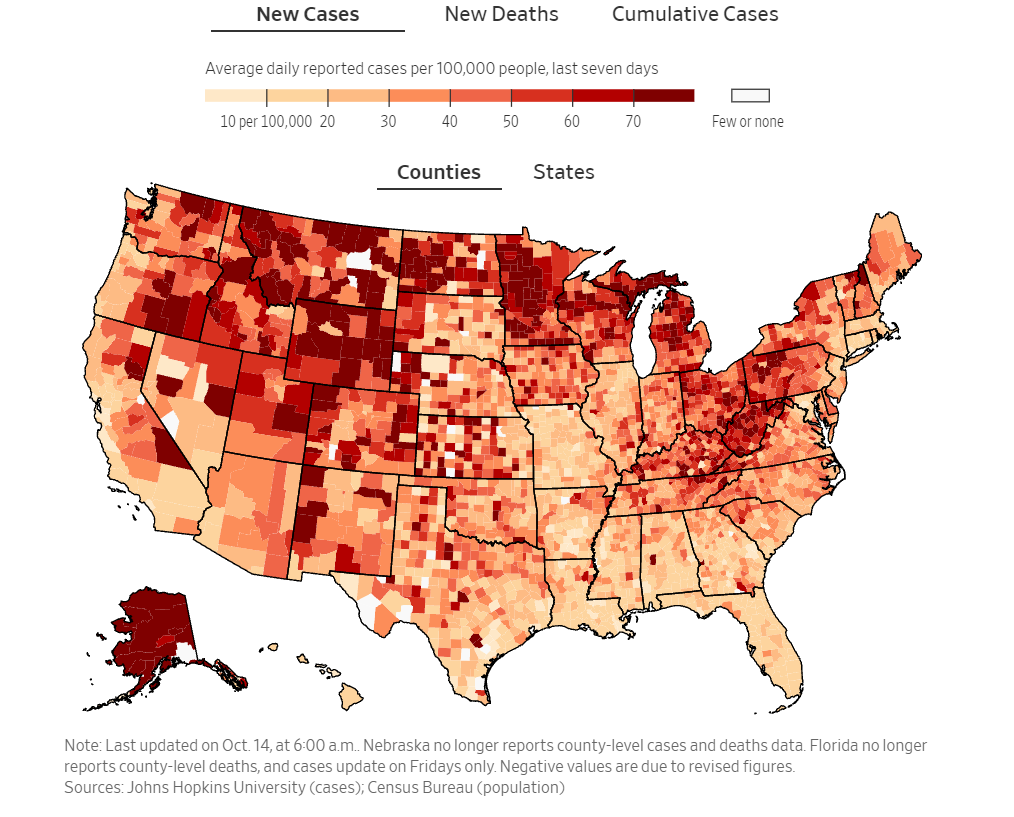
This heat map shows cases surging in the frozen tundra of Wisconsin & Minnesota, as well as, in the Rocky Mountains and along Appalachia - just as Fall brings forth cold and snow to parts of the Rockies.
The seasonally of COVID-19 has long been theorized and has recently demonstrated in a recent scientific paper, but as the saying goes “a picture is worth a thousand words”. Below is a map of US average high daily temperatures for October:

The visual correspondence between the green and blue temperature areas and higher current COVID-19 rates is very clear.
I originally found the WSJ COVID-19 case heat map while doing follow-up research to an earlier post: Is Florida Mishandling COVID-19? . As the 1st heat map plot shows, Florida’s August into September wave of cases has subsided and now it is the northern areas’ turn. I look forward to a barrage of media reports on how high (but not high enough) vaccine rates and mask mandates in Minnesota, Wisconsin, and Michigan don’t seem to affect the spread of COVID-19.